Ambleside JFC already has an existing brand, the client wanted us as designers to incorporate thee existing brand with new designs. This could be by using similar colours, fonts, mascots or themes. There are pros and cons of a project with this decree. For example, some pros are that we as designers, have a base. We have colours, themes and styles. Therefore, a foundation we can work off. This foundation means we have some basic ideas that we can now improve and add our own unique touches and changes. However, this idea of making it unique and different, can only be completed to the best of my ability if I was given a clean and blank slate. I could adopt ideas, schemas and research by understanding whats best for the brand due to previous experience. For example, I have learnt the colours red and grey are corporate; whereas yellow and pink are more informal. Without an existing brand, I can now do what I think is best for the design. Whereas, existing guidelines mean I am working with previously designed work.
Ambleside have previously designed work they want improving. They have stated that due to a low budget they are not willing to change existing colours, as football kits and pitch colours use this palette. They are willing to accept a new theme or mascot; which could be really interesting to create. To further understand Amblesides existing brand, I made a mindmap explaining my thoughts and understandings of their brand.
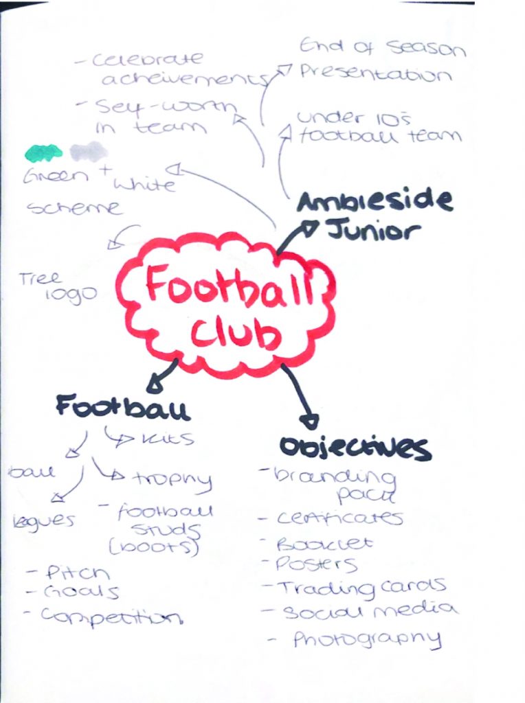
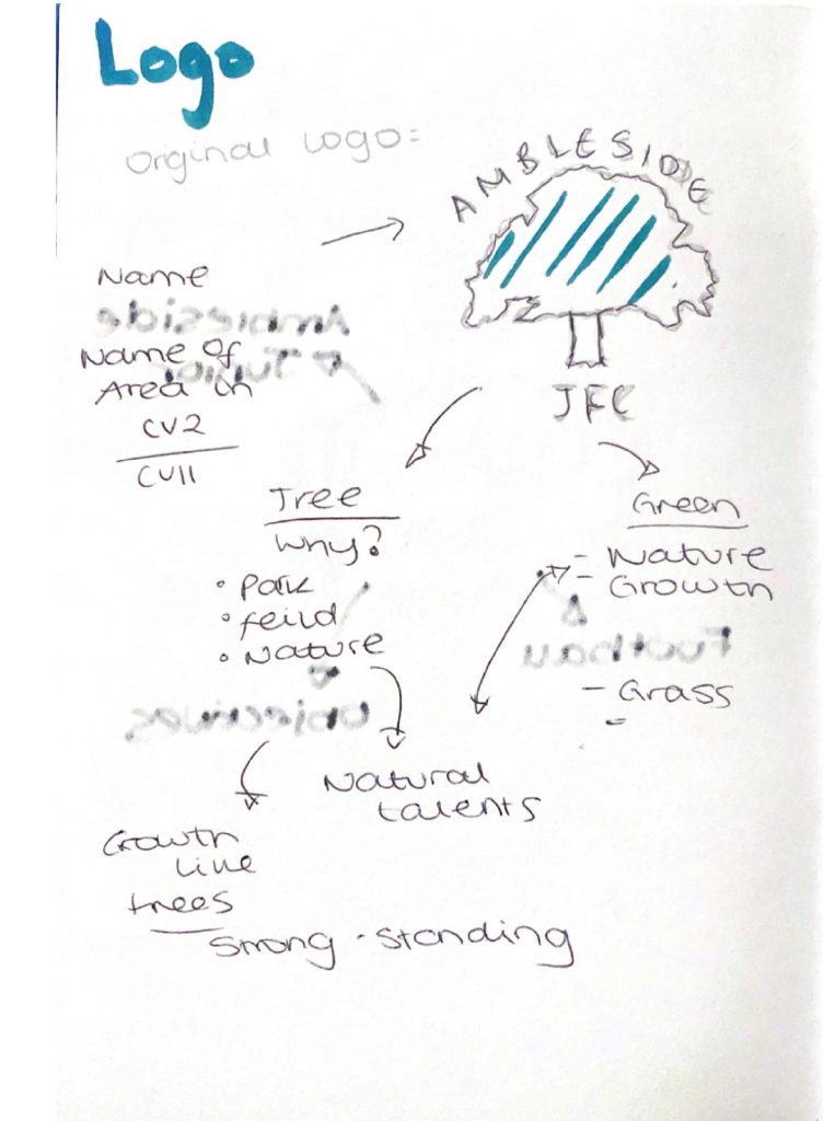
I understood that the brand uses Green and White as their kit colours and the theme they use in the logo is of a tree. The tree identifies with the area of Ambleside. This is a naturally proportionate area existing around a largely green and forested area. This mindmap shows the different connotations I sought when trying to understand the brand I was working with.