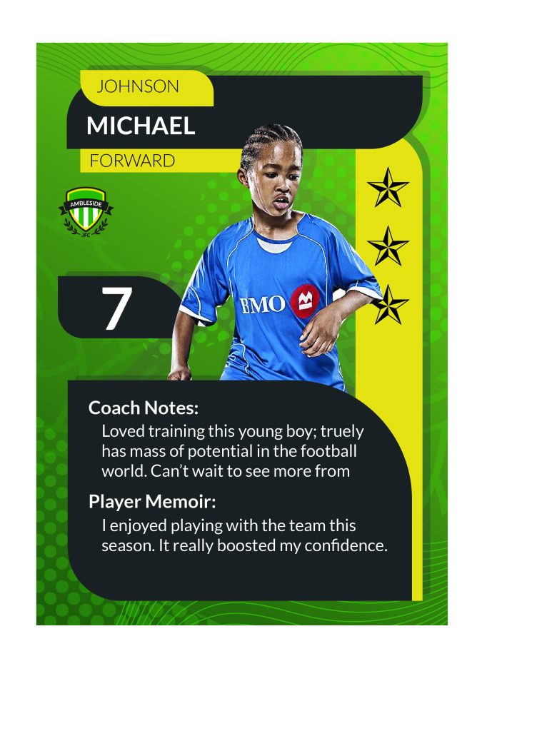
The booklet is supposed to contain 32 pages with 20 of which are made from 1 template. The template to this was for each student to have one page to themselves. This can contain a quotes, messages, memoirs or notes. In a yearbook, usually each student gets a little plaque with their photo and a personal message. This was what the 20 pages is for. A page for each player. I then suggested to the team that maybe the 20 pages could be quite similar to the trading card. – as the trading card is a unique to the player so is the page. I then played around with different styles and themes to differentiate the trading card to the page. Here is what I came up with.
This is quite similar to the trading card, it meant that the image is the same, so in terms of means; can be easy to carry out. We were told that when we would take images of the players, it would be part of their football playing time. Therefore, using the same image can be helpful to both parties. I think the use of the same text boxes is very cohesive with the trading card – giving all design work a common theme. The greatness about using a similar style is that it is so easy to manage a teams work by using similar themes and styles. This was massively carried through by the patterns we used.
The text in the bottom gives the student space to write somethings and the coach to write something. These are both so significant in creating pride with the player, making them feel part of the team and a memory.