Another team member also needed some help creating some design work. I tried to also help them as the language barrier was an issue. This person did not attend many meetings and therefore could not understand the task at hand. I had many issues with this member as I initially wanted to do the booklet. This member fought her way into doing it and pushed me out using my ‘attendance’ as the reason. This was not an issue for me so I backed away and let her take the design work. However, when she began struggling, we discussed as a team that I should give some guidance. This is what I ended up creating for the brief. It is a designed front cover for the booklet and holds ideas for other front covers. I am really proud of this because I steered massively away from the unsophisticated and immature designs. I took some advice about ‘less is more’ and adopted this in my work.
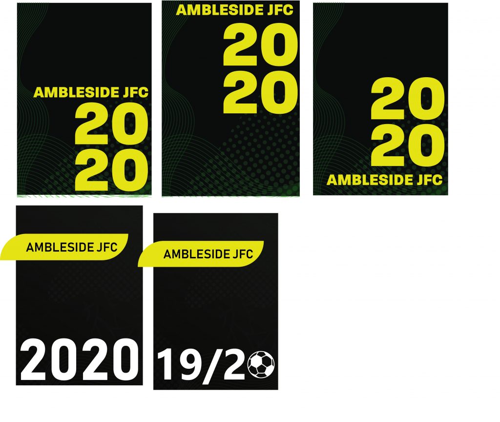
The reason for the colour black in the background was because it made it look sophisticated and simple. A white background seems cheap if not designed correctly. I tried playing around with different titles, text boxes and numbers. I think the simplicity of this design, with the large numbers, the bold text is very mature looking and would look great on any shelf.
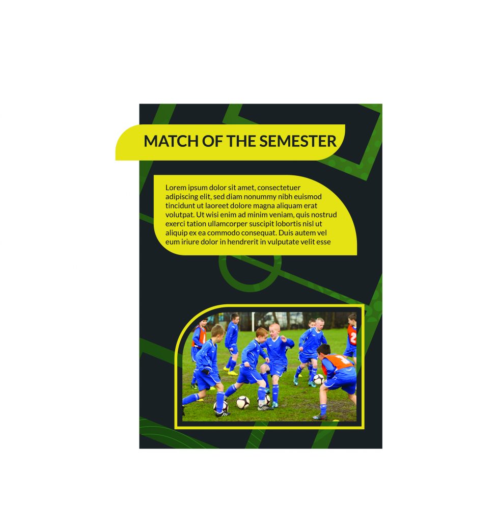
This is a version of the interior of the booklet. The design holds a very similar text box, colour scheme and pattern. I did change the background pattern to use the outline of a football pitch. To some group members, they thought this wasn’t the right choice. However, I really liked it.
I think these ideas and designs are really sophisticated and professional looking. My team members agreed and discussed to the member responsible how they should adopt a similar style to mine. The team member felt offended and designed the booklet her own way. The problem of this lead to our team not entirely having design work that was similar. Here is an example of the final booklet.