If I was to own a football club, I would definitely call it Rianimation FC.
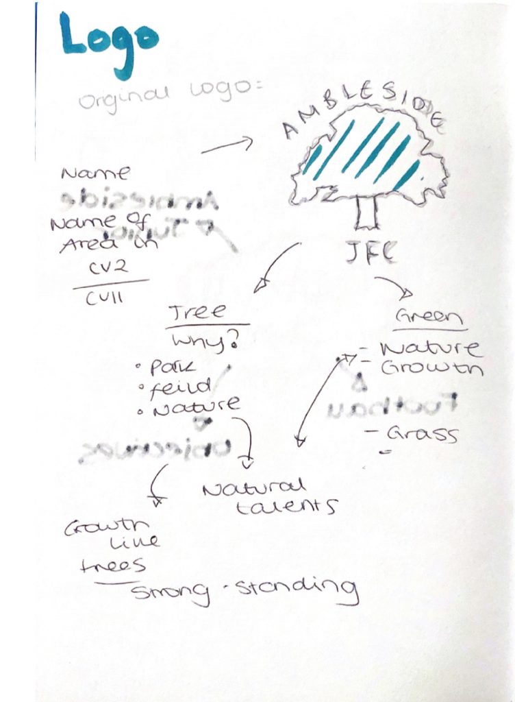
The Ambleside logo needed a massive revamp. It was unprofessional and not clean or sophisticated. It looked like it was created on Microsoft Publisher. The first question I asked myself was, does this scream football? No. So I began with creating again, another mindmap. This was so that I could further understand the logo and what they wanted to say.
Ambleside wanted to continue using their colours, therefore I intended to draw out some logo ideas. This would place me and my group in a position to see a variety of different ideas and explanations. For example, Greta, a team member, understood my logo ideas and had very similar ones. This was helpful because as a group, we saw a pattern in which our work could go. However, another team member stated that they did not like our ideas and therefore, we tried to understand what we could change.
The reason I used the badge shape in the top left logo idea, is because it represents a medal or award. The second logo on the top right uses a circular shape as though it represents a ball. The bottom logo uses leaves around the side. This was because the previous logo features a tree. This seemed important to the existing brand.