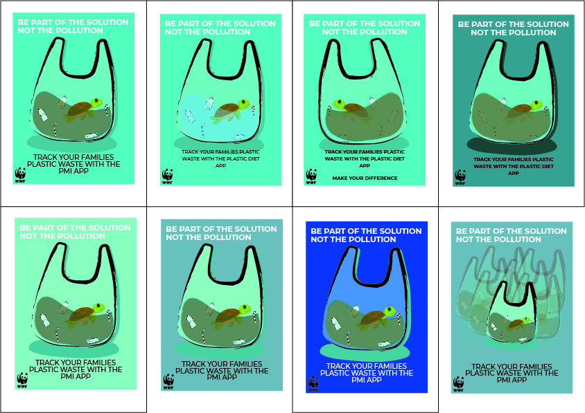
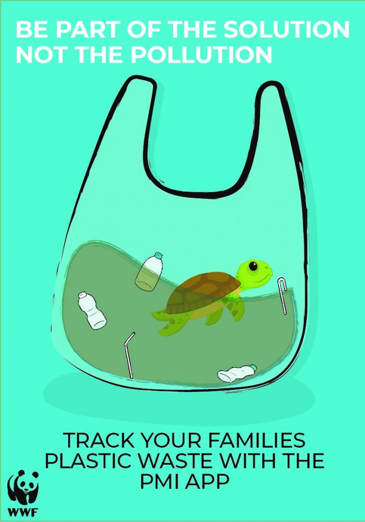
These are a variety of poster ideas I came up when creating ideas for the poster. The reason I went with this theme was to adopt more of an oceanic and memorable poster idea. For example, the poster has plastic bag with plastic waste, some water and a turtle inside showing that the campaign was specifically targeting plastic pollution in the ocean before anyone viewing the poster had to read anything. This is an effective use of graphics work because things like posters are often ignored by people walking by so if the picture alone sends a powerful enough message, it is possible that it could draw the passer-by in or still cause them to think about the issue as they go on with their day. By incorporating a call to action, what the viewer of the poster should do, at the bottom by asking them to visit a website, I made sure I tackled the call to action section of the brief. However, the poster doesn’t highlight the cause in any detail. The text at the top of the poster does no add any information and means that although my poster idea was effective at the parts of the brief they did follow, they didn’t provide all the information needed in order to be considered a good piece of work.
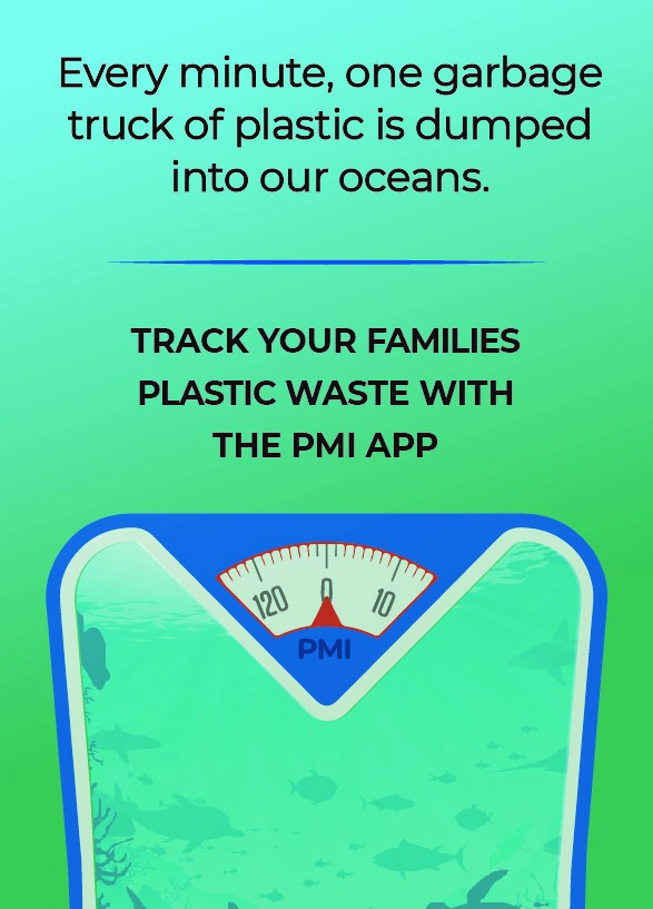
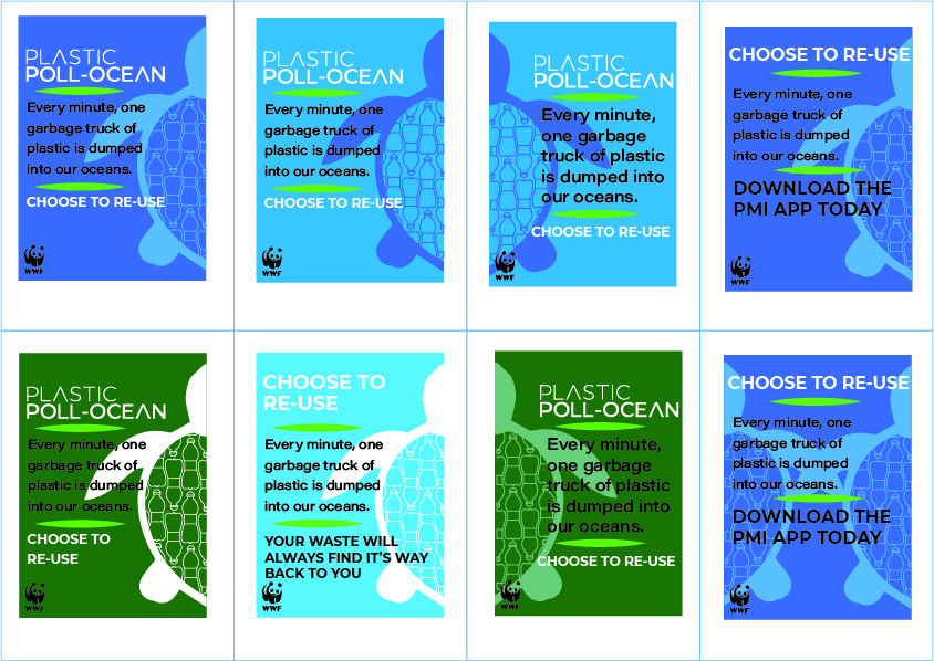
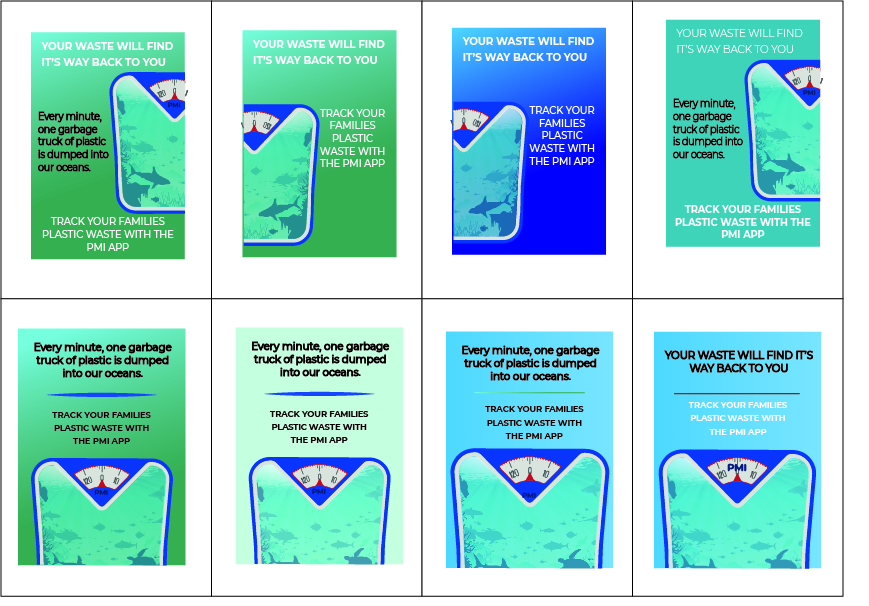
This is another poster idea, it has a scale with the ocean in it because the theme of the poster being measuring plastic waste. This is also seen by using PMI instead of kg on the scales. The poster also has a cause to the problem highlighted at the top of the poster stating “Every minute, one garbage truck of plastic is dumped into our oceans”. This follows the brief in getting the public talking by raising awareness about plastic waste in such a powerful way. Lastly the poster does follow the brief with a call to action as well, the poster encourages families to measure their PMI through downloading the app which helps people actively see their impact on a global problem to try and encourage everyone to do their bit to help reduce plastic waste.
Colour is an important factor in graphic design as it stimulates the part of the brain that helps define different shapes and objects, therefore using colour in design can help the audience identify different objects and shapes in illustrations. Complimentary colours are also significant when designing pieces of work; they allow a designer to use colours based on their hues and saturations and give the creator other colours that work best with their scheme. For example, green and red are complimentary. My idea is tailored to a blue and green colour scheme. The complimentary colours of this are orange and red; which I have used in the scales. I then used a black typeface which is contrasting to the blue and green gradient background. All the colours in my poster are either complimentary, contrasting or bilateral. Bilateral colours are colours that are next to each other on the colour wheel. These two are the blue and green. They work so well together in the gradient background because they are next to each other on the wheel.
I have placed some developments down below: